Page 1 of 2
Possible hint at new number design?
Posted: Thu Aug 10, 2017 10:39 am
by justducky0
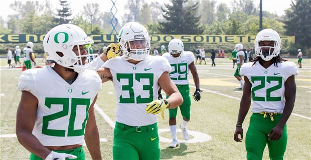
Saw this in the practice photo's....I could only find 3 players wearing them - notice no "o" on the neck and piping inside the numbers as well as a different font... Could be testing for new uniforms. Could be nothing.
Third picture is what the practice jerseys usually look like.


Re: Possible hint at new number design?
Posted: Thu Aug 10, 2017 10:48 am
by greenyellow
I saw these and was wondering the same thing. Then after McNamara mentioned it in yesterday's practice report, I'd say it's something to keep an eye on. I'm personally not a fan of the new numbers since it just seems too tall and skinny, which seems to be how Oregon numbers have going for the last few sets.
Re: Possible hint at new number design?
Posted: Thu Aug 10, 2017 10:58 am
by justducky0
Definitely a "modern" look and a big difference from the rats in Corvallis. I am surprised we havent seen anything leaked or should i say... "leaked" yet.
Re: Possible hint at new number design?
Posted: Thu Aug 10, 2017 11:03 am
by StevensTechU
I wondered the same thing when I saw the practice photos. I'd bet that's what they go with, as in years past, helmet/jersey designs from practice found their way onto the field.
Re: Possible hint at new number design?
Posted: Thu Aug 10, 2017 11:35 am
by Phenom
I wouldn't mind those.
Re: Possible hint at new number design?
Posted: Thu Aug 10, 2017 11:37 am
by duckfan22
they look fine to me.. I think Willie wants to get back to basics and
win before they go all out...
Re: Possible hint at new number design?
Posted: Thu Aug 10, 2017 11:39 am
by greenyellow
I just don't think they have the size and proportions right for it yet since you see the new font goes almost all the way to the belt line while the older font stops in the mid-abdominal area.
Re: Possible hint at new number design?
Posted: Thu Aug 10, 2017 12:12 pm
by justducky0
It just seems too big and a little off center. To be fair... back to the basics could just mean not having all those stupid 1 off jerseys like they did last season. Gahd that was terrible.
Re: Possible hint at new number design?
Posted: Thu Aug 10, 2017 12:36 pm
by greenyellow
justducky0 wrote:It just seems too big and a little off center. To be fair... back to the basics could just mean not having all those stupid 1 off jerseys like they did last season. Gahd that was terrible.
If what Taggart is saying is true, we'll finally have a set of uniforms that go together and are interchangeable once again. I think the issue with the uniforms started appearing after the 2013 Alamo Bowl, where they introduced new uniforms but then kept using the previous set and the new set together the following season.
Re: Possible hint at new number design?
Posted: Thu Aug 10, 2017 2:14 pm
by lukeyrid13
Historically our fonts have been subpar. The original "bellotti font" from the 05 civil war looked terrible. Then the silver numbers on all the jerseys from 09-11 were very hard to read. I've always loved our jerseys on the whole(sans blue vs UW that was dumb) but the fonts haven't been great.
Re: Possible hint at new number design?
Posted: Thu Aug 10, 2017 5:54 pm
by UOducksTK1
color is fine, size is too big.
Re: Possible hint at new number design?
Posted: Thu Aug 10, 2017 6:06 pm
by greenyellow
Looks like Freeman and the other players wearing the new number font were back wearing the old one. Starting to look like this was a limited, one-day wear test for Nike.
Re: Possible hint at new number design?
Posted: Thu Aug 10, 2017 6:06 pm
by UofO8
lord that looks terrible. You can especially see how bad it is in the third picture with the 21 next to 73.
Re: Possible hint at new number design?
Posted: Thu Aug 10, 2017 6:57 pm
by gogreen55
It doesn't look as bad in this picture...
Re: Possible hint at new number design?
Posted: Thu Aug 10, 2017 7:04 pm
by UofO8
gogreen55 wrote:It doesn't look as bad in this picture...
Only because of the perspective. 29 is way further back than the others so it's not going to look massive in comparison.