Page 3 of 3
Re: ASU Rebranding
Posted: Tue Apr 12, 2011 9:22 pm
by buckmarkduck
The basketball unis still suck. Why do they have the most boring unis in basketball?
Re: ASU Rebranding
Posted: Tue Apr 12, 2011 9:34 pm
by UofO8
God, those are lame. Such a lame, generic logo....that's not even a pitchfork.
Re: ASU Rebranding
Posted: Tue Apr 12, 2011 10:52 pm
by UOducksTK1
wheaton4prez wrote:Heh.
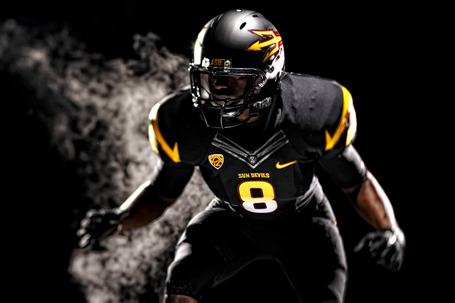
Improved uniforms. But, some issues, imo. The "ASU" on the sleaves doesn't seem to fit. Wrong font. Too large. Not enough space from the line on the sleave. Would have been better with a micro-sized logo there or no logo at all on the sleave.
I don't really like the black with the rest of their colors. The pitchfork on the helmet is placed at a goofy angle.
Still. Improved on what they had.
Dude couldn't agree more about the ASU on the sleaves. It looks so out of place, fugly. Otherwise, these jerseys are pretty much sick.
Re: ASU Rebranding
Posted: Wed Apr 13, 2011 7:59 am
by NCDucks09
Re: ASU Rebranding
Posted: Wed Apr 13, 2011 12:03 pm
by greenyellow
The ASU unis are growing on me, but I just have a feeling that they'll revert to using Sparky on the helmets again in at least 5 years.
Re: ASU Rebranding
Posted: Wed Apr 13, 2011 1:09 pm
by Supreme
I like WSU's more than ASU's.
Is it time for Oregon so redesign yet?
Re: ASU Rebranding
Posted: Wed Apr 13, 2011 1:18 pm
by greenyellow
Supreme wrote:I like WSU's more than ASU's.
Is it time for Oregon so redesign yet?
Probably will see one set during this season, with a full unveil for the 2012 season.
Re: ASU Rebranding
Posted: Wed Apr 13, 2011 2:07 pm
by UofDuck
Supreme wrote:I like WSU's more than ASU's.
Is it time for Oregon so redesign yet?
I'm with you. Like the gray on gray helmet. Kinda military-ish pilot like.
Re: ASU Rebranding
Posted: Wed Apr 13, 2011 2:12 pm
by Elduderino
I actually like both team's redesign. ASU's Maserati rip-off "Trident/Pitch Fork" gives them (they hope) an instantly recognizable logo similar to what the Oregon "O" did for us. WSU looks like they got more creative with their typical design.
I just remember 10 years ago when the UO was ridiculed by everyone for their uniforms, mixing and matching, etc.....Now? Imitation is the sincerest form of flattery.
Re: ASU Rebranding
Posted: Wed Apr 13, 2011 2:59 pm
by Duck07
Elduderino wrote:I actually like both team's redesign. ASU's Maserati rip-off "Trident/Pitch Fork" gives them (they hope) an instantly recognizable logo similar to what the Oregon "O" did for us. WSU looks like they got more creative with their typical design.
I just remember 10 years ago when the UO was ridiculed by everyone for their uniforms, mixing and matching, etc.....Now? Imitation is the sincerest form of flattery.
it was pretty funny to read that asu wr gerrel robinson said that if "the unis were the sole factor, i would have been at Oregon signed, sealed and delivered." haha
Re: ASU Rebranding
Posted: Wed Apr 13, 2011 3:11 pm
by canaduck
I don't hate the pitchfork logo but how can it replace Sparky that's a classic logo! Shoulders look brutal, pitchfork helmet would be ok as an alternate, but the old ASU look was one of my favourites in all of college football.
Re: ASU Rebranding
Posted: Wed Apr 13, 2011 5:08 pm
by ncduck
I've always been partial to the USB symbol on my pc so it's only natural that I would like it on a jersey.
Re: ASU Rebranding
Posted: Wed Apr 13, 2011 5:27 pm
by goducks75
To answer above, probably going to unveil the new uniforms at the CW this year. Always change them every 3 years with the unveiling of the new set of unis at the last home game of the 3rd year (diamond plates during the fog bowl in '05, wings against Arizona in '08, etc.). Wonder if that trend will continue this year.
As for the ASU unis, pretty much what others above have said. Like the pitchfork design on the helmet and the ASU on the shoulders are too big, like that there's less of an emphasis on that UGLY maroon, always liked the color black on jerseys (except when mixed with that ugly color orange), etc.
I like WSU's about the same but for different reasons. I don't like that they pulled the metallic gray as I've always liked that but some of those uniform combos are pretty good like ours (and, like ours, some of those combos are ugly as hell too).