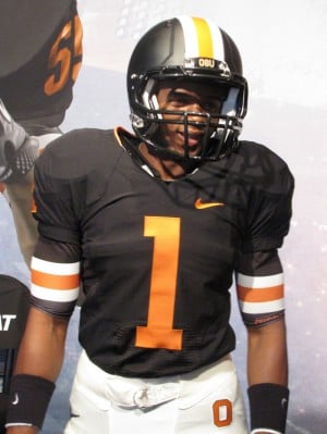
There isn't much originality in these uniforms. OSU is seriously like 15 years behind it's time. Really should have just stuck with what they had. What made them unique was the originality. They weren't bred to be unique and innovative.
It's actually a modern look on a retro design (a good design at that).
There isn't much originality in these uniforms. OSU is seriously like 15 years behind it's time. Really should have just stuck with what they had. What made them unique was the originality. They weren't bred to be unique and innovative.
It's actually a modern look on a retro design (a good design at that).
Well it looks like a lot of other teams out there, and really if they wanted to go old school, then they should have. No need to try to modernize anything, because it just looks average.
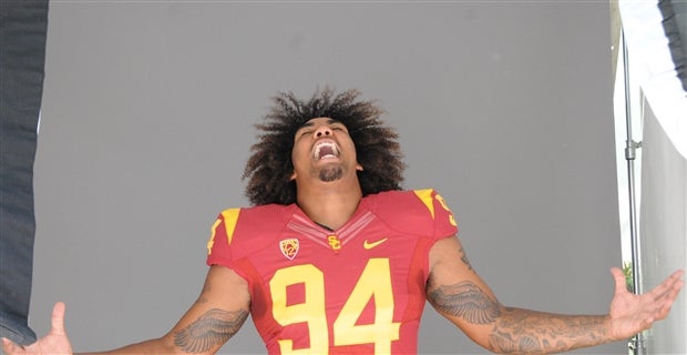
Teams like OSU and USC should stick with their set of jerseys for another decade or two.
for as much as I loathe the team and their colors I think this is a great update. I like the bronze/copper colors they added and the schemes and design. I think it is great for them. Let's be real...they need all the help they can get. I also love the aspect of being helped out by Nike. It takes away some of the excuses and the finger pointing and whining about our advantages and being on the nipple of Uncle Phil, even the beavs have to conform to the new business of college football. Honestly I don't know how anyone can look at these and think they look worse than the white pant/orange top/black helmet combo they rolled with the last few years...those were hideous. I think the unis look pretty solid.
They look pretty cool.... Except the tooth/teeth on the facemask, looks really bad IMO. Also, they weren't going for a whole rebranding, just a freshened up look, which they achieved IMO.
Overall... meh, whateves.
"How do we go from nine to one?" - Chip Kelly
“Our expectations are to win every game we play." - CK
Walking around Gateway Mall, I heard a fair number of Beav "fans" belly aching about the new mascot/logo... Consensus seemed to be something like, "What the heck is that thing, a bucktoothed ferret???"
Then the began comparing the unis unfavorably to retro Bengals-style, and it went downhill from there.
BTW, prepare for a boycott of the "Oregon Sports" store, near the food court... Duck gear has now invaded the smallish back room where the Beavitch apparel was once exclusively stocked.
Autzen Stadium... Where great teams go to die...Hard!
uodux1212 wrote:They look pretty cool.... Except the tooth/teeth on the facemask, looks really bad IMO. Also, they weren't going for a whole rebranding, just a freshened up look, which they achieved IMO.
Overall... meh, whateves.
Is that what it is suppose to be?
It looked like they were just trying something different and extending the stripe to the face mask.
I actually like the new beaver logo, it reminds me of the Pats logo. People didn't like that thing at first either.
They really aren't bad, I think people just have issues with change. If they tried to "freshen up" LSU's unis I would HATE everything and anything they put out there.
I actually like the new logo and uni's. Not a big Orange and Black fan, but that must come from deep in my DNA because I hate gold and purple too. I'm looking at you UW. By gold, I mean UW's khaki.