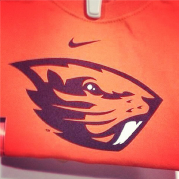
I was looking around some uniform blog/forum and there's a leaked image of OSU's possible new logo that could be used as part of Nike's attempt to rebrand the AD. I'm not so sure it's even a step up from their current logo. Just a really odd shape and doesn't really look all that beaver-like (more like a fish head to me.)
Braveheart wrote:I'm not really feeling that. Just a odd look for a sport logo.
They are working with a beaver here..... Really, there's a reason they say you can't polish a turd. I would say that given the mascot that they have to work with, they have done about as well as can be expected.
OregonFan4life -
My source just said Chip is officially back!
It will be announced at Autzen press conference tomorrow afternoon!
Braveheart wrote:I'm not really feeling that. Just a odd look for a sport logo.
Agree. And unlike most people on this board, I don't hate Oregon State.
Looks like a minor league hockey mascot.
Last edited by uostudent on Sun Feb 10, 2013 11:19 am, edited 1 time in total.
“If everybody in this room just want to be real with themselves, this game could have went either way,” he said. “We turned the ball over a lot. We beat ourself. Just be real with yourself right now. We beat ourself.”
-Jameis Winston after Oregon's decisive 59-20 victory over Florida State in the Rose Bowl
greenyellow wrote:I was looking around some uniform blog/forum and there's a leaked image of OSU's possible new logo that could be used as part of Nike's attempt to rebrand the AD. I'm not so sure it's even a step up from their current logo. Just a really odd shape and doesn't really look all that beaver-like (more like a fish head to me.)
greenyellow wrote:I was looking around some uniform blog/forum and there's a leaked image of OSU's possible new logo that could be used as part of Nike's attempt to rebrand the AD. I'm not so sure it's even a step up from their current logo. Just a really odd shape and doesn't really look all that beaver-like (more like a fish head to me.)
Braveheart wrote:I'm not really feeling that. Just a odd look for a sport logo.
They are working with a beaver here..... Really, there's a reason they say you can't polish a turd. I would say that given the mascot that they have to work with, they have done about as well as can be expected.
Well, ours at least doesn't have a completely odd shape and you can immediately tell it's a duck. The new OSU logo just looks weird and it could be interpreted as a couple different animals if seen by different groups.
I actually think the logo for the SB Nation OSU page is a lot better than the Nike one.