Penky26 wrote:this season overall from the helmets to these have been a step backwards when it comes to being cutting edge with gear.
^+1
Especially the helmets! This years version(s) look like high school helmets. I wish that the U of O would work out their issues with the creators of the winged helmets and bring those back...or just stick with the "O" or interlocking UO.
Rumors have that they are in the process or have worked out their differences but not soon enough to new helmets ready for the Alamo Bowl. If they don't have new helmets next year, then the rumor is either bunk or something fell through.
^
All I can say is that I hope the Ducks don't wear the white "snow globe" helmets that they had out during the TCU-DUCK press conference. Those were my least fav helmet of the past season.....
hjpop wrote:Sorry for dragging this up but, on Nike's site, there are newish looking uniforms going for $150. Are these the "new" uniforms for the bowl game?
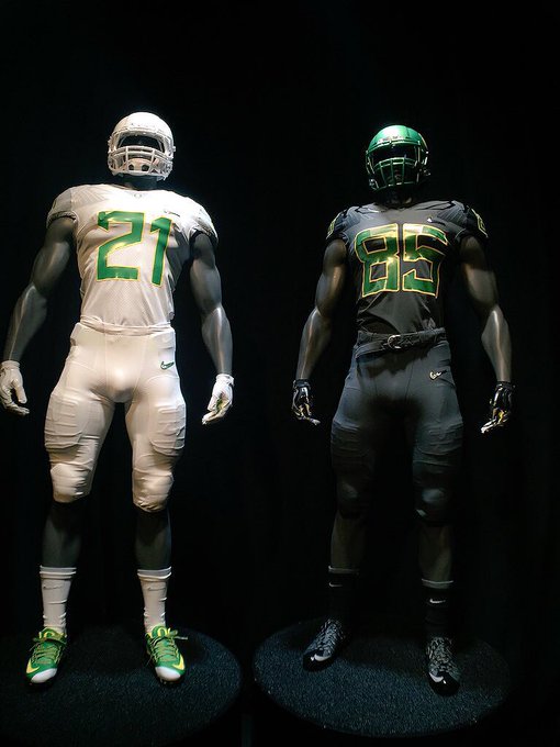
The whites are rather hideous in person (dunno what's up with the gray sleeves) and the shoulders are not silver but some sort of white-gray mix. Maybe it'll show differently between the sale jersey and the player jersey...but even the Duck Store ladies were not too impressed.
greenyellow wrote:I'm still not sure about the new number fonts and shoulder graphics so I'll wait until we get some explanation for the design choices.
I like the new numbers, the other ones looked feminine.
greenyellow wrote:I'm still not sure about the new number fonts and shoulder graphics so I'll wait until we get some explanation for the design choices.
I like the new numbers, the other ones looked feminine.
So these are "edgy"?
Autzen Stadium... Where great teams go to die...Hard!
greenyellow wrote:I'm still not sure about the new number fonts and shoulder graphics so I'll wait until we get some explanation for the design choices.
I like the new numbers, the other ones looked feminine.
greenyellow wrote:I'm still not sure about the new number fonts and shoulder graphics so I'll wait until we get some explanation for the design choices.
I like the new numbers, the other ones looked feminine.